Production Log 6 (3rd Dec.2013)
Analysis of Film Opening Sherlock Holmes (Guy Ritchie, 2010)
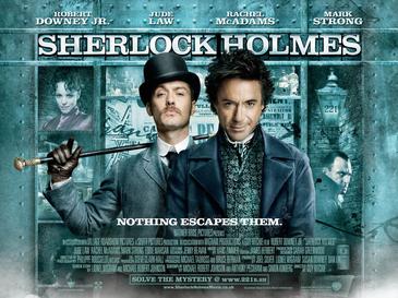
I have analysed the opening sequence of Sherlock Holmes. The opening sequence is visually stunning as it combines film footage with VFX to create an authentic Victorian period quality. For example, the titles appear to be hand-written on old paper in sepia ink with watery blotches and ink splatters. Pen and ink line wash is used in combination with longitudinal linotype. Many close-ups of the heroic protagonists merge with live action, again bringing this Victorian period drama up to date. The colours are all muted to suggest the gas-lit streets and murky corners of the Victorian underworld, a place of danger and fear.
Analysis of Film Opening Sherlock Holmes (Guy Ritchie, 2010)
I have analysed the opening sequence of Sherlock Holmes. The opening sequence is visually stunning as it combines film footage with VFX to create an authentic Victorian period quality. For example, the titles appear to be hand-written on old paper in sepia ink with watery blotches and ink splatters. Pen and ink line wash is used in combination with longitudinal linotype. Many close-ups of the heroic protagonists merge with live action, again bringing this Victorian period drama up to date. The colours are all muted to suggest the gas-lit streets and murky corners of the Victorian underworld, a place of danger and fear.
No comments:
Post a Comment